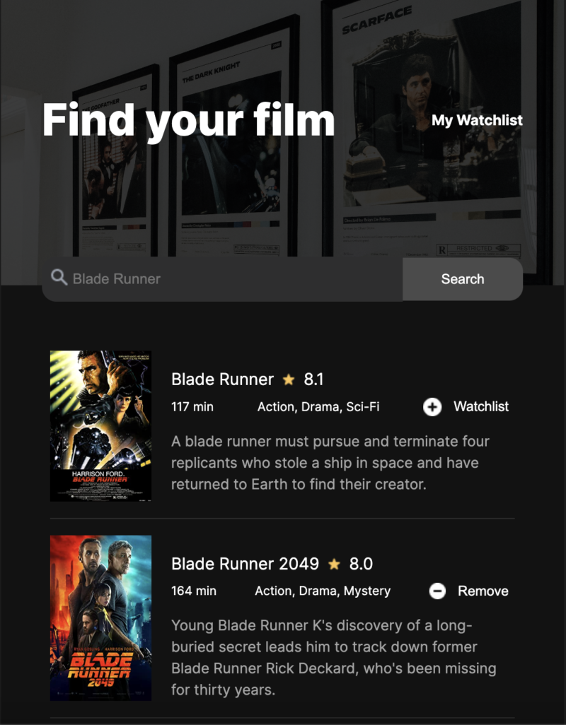
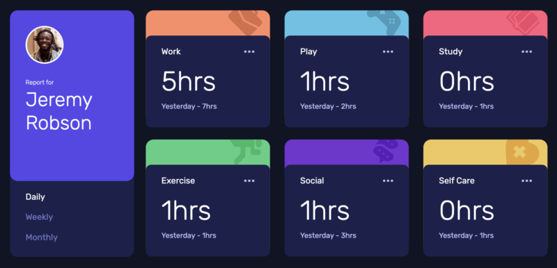
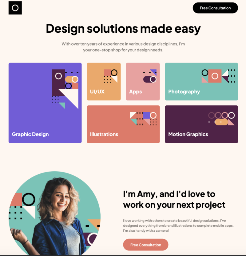
This was a great challenge of a website to build. I made this website 100% responsive on all screens.
In order to build out the design of this website I used both Flex-Box and Grid.
What I am most proud of with this project is how I was able to make the mobile menu appear and disappear when clicked on.
You can view the project here and if you would like to see the code you can find it here.
