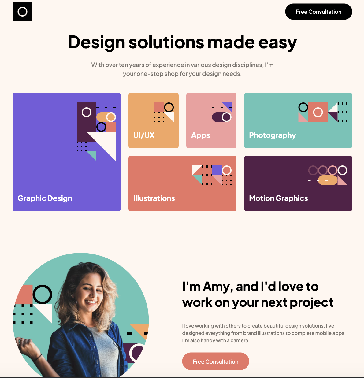
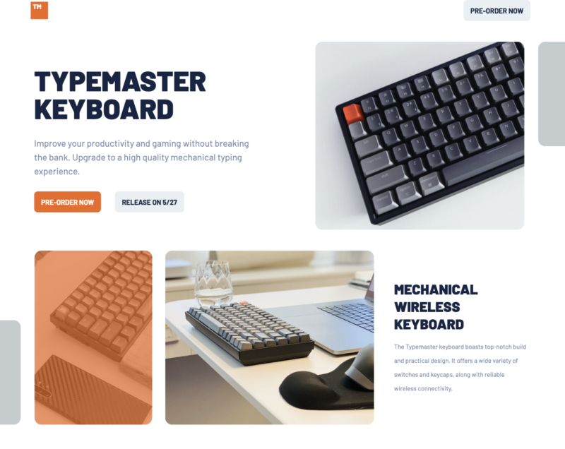
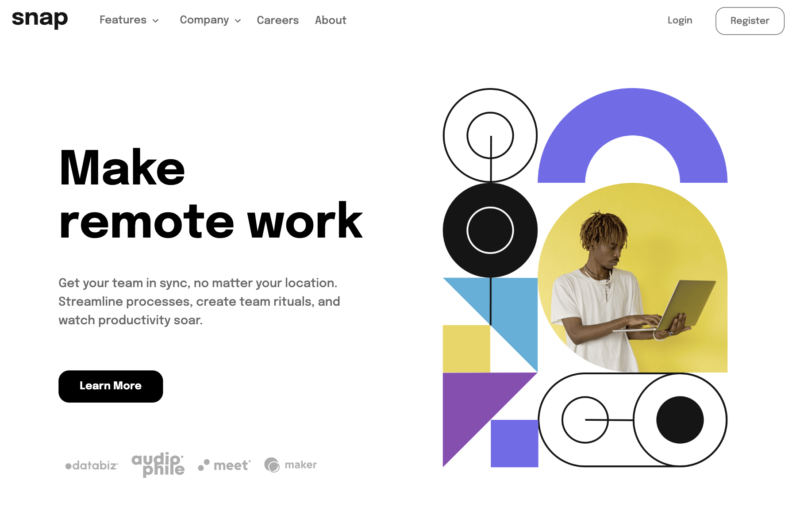
I built this project using HTML, CSS, and Javascript.
I used Flexbox and Grid to build out the structure of this website. I find that people always tell you to either use one or the other and maybe in most cases this is correct but I wanted to see if I could maximize both to make the website as responsive as possible.
I really like how the design changes on mobile, tablet, and desktop, so please take a look at the website at different screen sizes.
At the bottom of the webpage I wanted to have a dynamic image slider that shows the images of the projects and never ends but rather loops around when the user clicks on it. In order to get this experience I installed and configured Splide.JS. You can use the buttons to scroll or you can actually click and drag the images.
Overall I had a lot of fun building this project, if you would like to take a look at the website, you can see it here. If you would like to view the code you can find it here.
